Data Grid for .NET MAUI – Version 1.0.6 Demo
Published:
Modified:
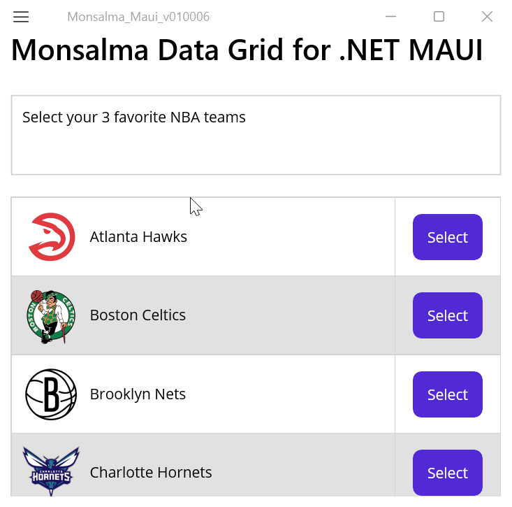
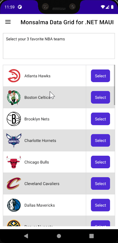
Version 1.0.6 introduces a new column type for Monsalma data grid control – the command (button) column. We’ll be using the free DataGrid control for .NET MAUI to list all NBA teams (their names and logos) and select 3 favorite teams.
The source code is available on GitHub – https://github.com/Monsalma/Monsalma.Maui.Controls/tree/main/Monsalma-Maui-v010006.
To get started, please download Monsalma.Maui.Controls NuGet package. The package includes free data grid for .NET MAUI:
https://www.nuget.org/packages/Monsalma.Maui.Controls/1.0.6.
Additional resources:
Model (Data)
Instances of the NBATeam class (Monsalma_Maui_v010006.Data.NBATeam) contain the data. The class inherits from INotifyPropertyChanged because we need to notify changes of the IsSelectedText property in order to switch between “Select” and “Deselect” button text.
public partial class NBATeam : INotifyPropertyChanged
{
	#region Properties
	private bool isSelected;
	public bool IsSelected
	{
		get => isSelected;

		set
		{
			if (isSelected != value)
			{
				isSelected = value;
				OnPropertyChanged(nameof(IsSelected));
				OnPropertyChanged(nameof(IsSelectedText));
			}
		}
	}

	public string IsSelectedText => IsSelected ? "Deselect" : "Select";
	public string Name { get; set; }
	public string ImageSource { get; set; }
	#endregion

	#region INotifyPropertyChanged
	public event PropertyChangedEventHandler PropertyChanged;
	public void OnPropertyChanged([CallerMemberName] string name = "") => PropertyChanged?.Invoke(this, new PropertyChangedEventArgs(name));
	#endregion
}
View Model
MainViewModel (Monsalma_Maui_v010006.ViewModels.MainViewModel) creates a collection (ObservableCollection) of NBA teams.
Relevant properties – Collection of teams (NBATeams) and collection of selected teams (SelectedTeams)
private ObservableCollection<NBATeam> nbaTeams;
public ObservableCollection<NBATeam> NBATeams
{
	get => nbaTeams;
	set => SetProperty(ref nbaTeams, value);
}

private ObservableCollection<NBATeam> selectedTeams = [];
public ObservableCollection<NBATeam> SelectedTeams
{
	get => selectedTeams;
	set => SetProperty(ref selectedTeams, value);
}
Command initialization
The view model initiates the command, which we’ll use later in XAML. It’s important to know that, by default, DataGrid sets command parameter (commandParameter) to a corresponding item from the item list which feeds the grid (Items bindable property). This default behavior can be overriden by using the CommandParameter bindable property of the DataGridColumnCommand class.
SelectDeselectCommand = new Command(
	execute: (object commandParameter) =>
	{
		if (commandParameter is NBATeam team)
		{
			if (team.IsSelected) // deselect
			{
				team.IsSelected = false;
				SelectedTeams.Remove(team);
			}
			else // select
			{
				if (SelectedTeams.Count < MAX_SELECTED_TEAMS)
				{
					team.IsSelected = true;
					SelectedTeams.Add(team);
				}
			}
		}
	},
	canExecute: (object commandParameter) => true
);
View (XAML)
MainPage (Monsalma_Maui_v010006.MainPage) represents the view.
Importing packages and local namespaces
First we import the package (Monsalma.Maui.Controls) and local namespaces (data and view model):
xmlns:controls="clr-namespace:Monsalma.Maui.Controls;assembly=Monsalma.Maui.Controls"
xmlns:data="clr-namespace:Monsalma_Maui_v010006.Data"
xmlns:viewmodels="clr-namespace:Monsalma_Maui_v010006.ViewModels"
Row styles
Similar to previous demos, then we define row styles (odd row, even row and selected row) for the data grid control:
<Style
	TargetType="controls:DataGridRowRegular"
	x:Key="RegularOddRowStyle">

	<Setter
		Property="CellBackgroundColor"
		Value="{StaticResource Key=White}" />

	<Setter
		Property="CellForegroundColor"
		Value="{StaticResource Key=Black}" />
</Style>

<Style
	TargetType="controls:DataGridRowRegular"
	x:Key="RegularEvenRowStyle">

	<Setter
		Property="CellBackgroundColor"
		Value="{StaticResource Key=Gray100}" />

	<Setter
		Property="CellForegroundColor"
		Value="{StaticResource Key=Black}" />
</Style>

<Style
	TargetType="controls:DataGridRowRegular"
	x:Key="SelectedRowStyle">

	<Setter
		Property="CellBackgroundColor"
		Value="{StaticResource Key=Yellow100Accent}" />

	<Setter
		Property="CellForegroundColor"
		Value="{StaticResource Key=Black}" />
</Style>
Command (button) column style
In this demo we also need to define the button style, to be used when defining DataGridColumnCommand:
<Style
	TargetType="Button"
	x:Key="ButtonCellStyle">

	<Setter
		Property="BackgroundColor"
		Value="{StaticResource Key=Primary}" />

	<Setter
		Property="TextColor"
		Value="White" />

	<Setter
		Property="HorizontalOptions"
		Value="CenterAndExpand" />

	<Setter
		Property="VerticalOptions"
		Value="CenterAndExpand" />

</Style>
Data template
Next, we define the data template for our templated column (DataGridColumnTemplated) which will contain team logo (Image) and team name (Label):
<DataTemplate
	x:Key="nbaTeamTemplate"
	x:DataType="data:NBATeam">

	<Grid
		Padding="5"
		BindingContext="{Binding Path=BindingContext, Source={RelativeSource TemplatedParent}, x:DataType=BindableObject}"
		HorizontalOptions="Fill"
		ColumnDefinitions="Auto, Auto">

		<Image
			Grid.Column="0"
			WidthRequest="64"
			HeightRequest="64"
			VerticalOptions="Center"
			Source="{Binding ImageSource}" />
		<Label
			Grid.Column="1"
			Padding="5"
			VerticalOptions="Center"
			Text="{Binding Name}" />
	</Grid>
</DataTemplate>
Selected NBA teams collection (ListView / ObservableCollection)
We’ll use ListView to display selected teams. The item template is pretty straighforward:
<ListView
	ItemsSource="{Binding SelectedTeams}">

	<ListView.ItemTemplate>
		<DataTemplate
			x:DataType="data:NBATeam">

			<TextCell
				Text="{Binding Name}" />
		</DataTemplate>
	</ListView.ItemTemplate>

</ListView>
All NBA teams collection (Monsalma Data Grid for .NET MAUI / ObservableCollection)
Finally, we define the data grid:
<controls:DataGrid
	Grid.Row="1"
	Margin="10"
	Items="{Binding NBATeams}"
	IsReadOnly="True"
	RegularOddRowStyle="{StaticResource Key=RegularOddRowStyle}"
	RegularEvenRowStyle="{StaticResource Key=RegularEvenRowStyle}"
	SelectedRowStyle="{StaticResource Key=SelectedRowStyle}"
	ShowHeaderRow="False"
	VirtualizationEnabled="False">

	<controls:DataGrid.Columns>

		<controls:DataGridColumnTemplated
			Width="*"
			MinWidth="100"
			CellTemplate="{StaticResource Key=nbaTeamTemplate}" />

		<controls:DataGridColumnCommand
			Width="Auto"
			MinWidth="100"
			DataBinding="IsSelectedText"
			Command="{Binding SelectDeselectCommand, Source={x:Reference MainVM}}"
			CellStyle="{StaticResource Key=ButtonCellStyle}" />

	</controls:DataGrid.Columns>

</controls:DataGrid>
Here everything should be easy to understand. If not, please refer to previous demos:
It is important to understand how DataGridColumnCommand is defined. We use the DataBinding bindable property because we want to have different values for different items (“Select” for items which are not selected, “Deselect” for selected items). If we wanted to have only one button text value, we would use the CommandText bindable property.
<controls:DataGridColumnCommand
	Width="Auto"
	MinWidth="100"
	DataBinding="IsSelectedText"
	Command="{Binding SelectDeselectCommand, Source={x:Reference MainVM}}"
	CellStyle="{StaticResource Key=ButtonCellStyle}" />
Screen capture GIFs
Windows
Android Emulator (Google Pixel 3 XL – API 30)
Leave a Reply